Insights
Emissions in focus for COP27 and stocks’ tough 2022

Emissions grow unevenly over the business cycle
Economic growth has lifted living standards for billions of people. But that growth has coincided with rapid expansion in carbon emissions, at least during the early stages of industrialisation and economic development.
Conversely, one of the few silver linings of economic contractions is slower growth in emissions.
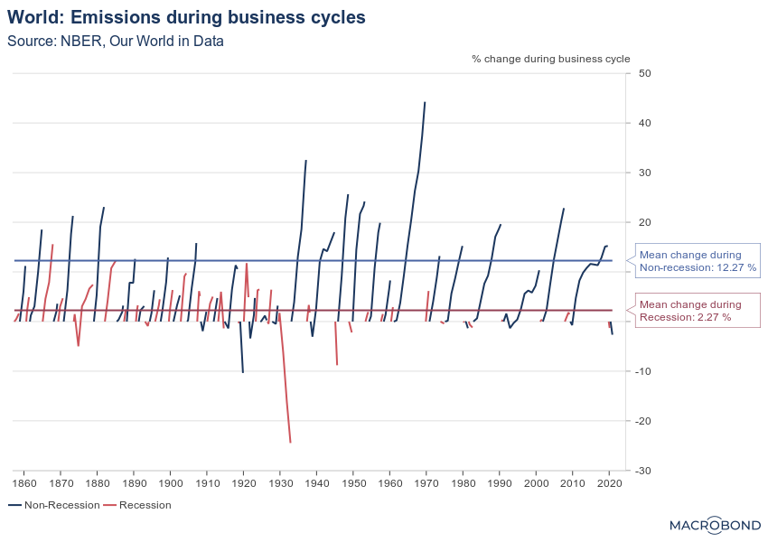
The following chart tracks global business cycles going back to the 1850s and graphs their estimated CO2 emissions. During a typical expansion (which lasts an average of 3.5 years in this period), emissions increased more than 12%. During a typical recession (about 1.5 years long on average since 1854), emissions increased by about 2.3% — a much slower pace even when adjusted for the shorter time frame.
Tip: This chart allows for the change region function.
Per capita emissions show which nations are using cleaner energy
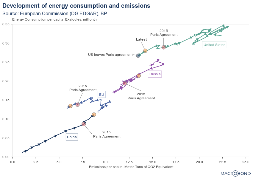
The following chart tracks energy use and emissions per capita for major economies over recent decades.
The US and the EU both saw an increase in per capita energy use and emissions until the 1990s, but since then, both economies have reduced per capita emissions steadily through a transition to cleaner energy. (The US has always emitted far more per capita than the Europeans, but both have made relative progress on that front: current per capita emissions are about half their peak.) Meanwhile, per capita energy use has slipped, but not as dramatically.
Russia’s emissions and energy use (and economy) collapsed after the fall of the Soviet Union. Both have recently picked up again.
China has been on a completely different trajectory, with energy use and emissions per capita rising steadily as the country industrialises.
Fed funds futures suggest pivot talk is premature
The Federal Reserve just raised its key interest rate by 75 basis points to a 14-year high of 4 percent. Is it still too early to talk about a “Fed pivot” to a more dovish stance?
Recent labour market data shows the economy is still going strong: unemployment is at a record low, and job vacancies are at a record high. Moreover, third-quarter growth surpassed expectations, with gross domestic product rising 2.6 percent, showing that the recession scare earlier this year was just that.
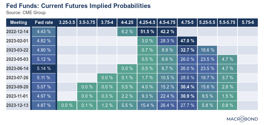
While the housing market has started to cool significantly, this has yet to materially affect the larger economy. That’s why it’s probably too early to talk of a Fed pivot, and futures are telling us as much. Traders are effectively betting that rates will peak above 5 percent next spring, as our table shows.
The Powell spread is almost negative
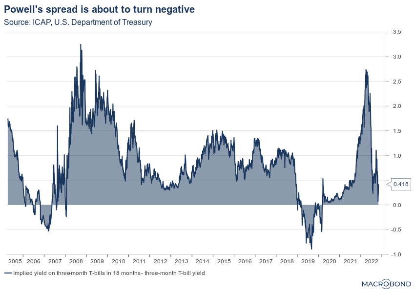
One of the key charts to watch when looking for a potential Fed pivot might be Chairman Jerome Powell’s preferred gauge of the bond market: the spread between the three-month Treasury yield and the expected yield on those bills in 18 months’ time.
As our graph shows, this “Powell spread” has decreased significantly as the Fed hiked aggressively. It’s now very close to inverting. And yield curve inversions are a classic harbinger of recessions.
This chart can only be accessed with a subscription to ICAP data.
US stock benchmark dragged down by tech pain
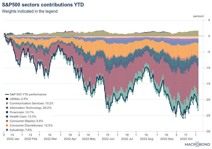
The chart below tracks the S&P 500’s 20 percent slide this year and breaks it down by sector. Almost every industry group has experienced negative returns — with energy being the notable exception.
Big Tech shares have been crushed in recent weeks, and the US benchmark’s information technology sector reflects that. It has by far the biggest weighting in the S&P 500: close to 30 percent.
Consumer discretionary and communications stocks, two sectors with weightings above 10 percent in the benchmark, have also contributed quite substantially to the recent equity market drawdown.
Unemployment is oddly low for a bear market
One of the more peculiar macro correlations is the one between US equity markets and the nation’s labour market.
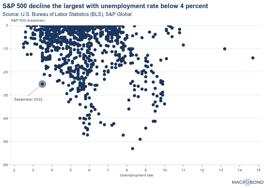
Historically, large declines in asset prices are correlated with a higher unemployment rate. (This is precisely why the economist Roger Farmer has advocated that central banks should directly target asset prices to manage economic fluctuations and unemployment.)
However, while equity prices have plunged this year, unemployment has continued to fall. The current situation is an extreme outlier, as the following chart shows: the biggest equity drawdown that has ever occurred with joblessness below 4 percent.
Macro-hedge-funds-win-and-fixed-income-funds-suffer
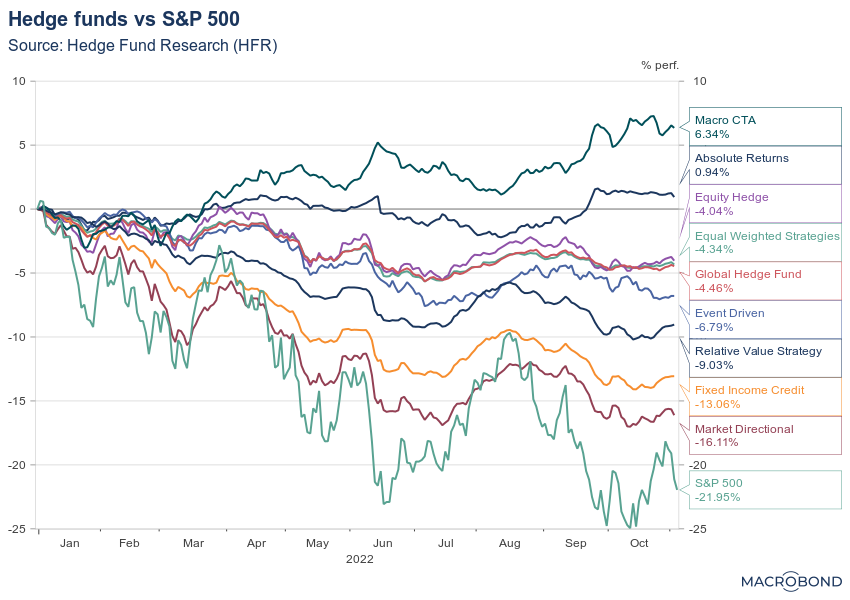
This is an update of a chart that we posted recently, tracking the performance of various hedge fund strategies versus the S&P 500. That broad equity benchmark is now doing worse than all strategies.
One of the interesting things about the current environment is how macro-driven it is: after a series of large macroeconomic shocks, central banks are the most important actors as they rapidly tighten rates to combat inflation.
Macro funds have navigated this tricky environment the best so far, posting positive returns of several percentage points.
Unsurprisingly, fixed income hedge funds have suffered. They’re down more than 10 percent year-to-date after rate hikes slaughtered global bond markets.
Chinese pork prices are rising again
China is the world’s biggest consumer of pork, and it’s heavily weighted in the national consumer price index. The nation even has a strategic frozen pork reserve to shield farmers and consumers from price swings.
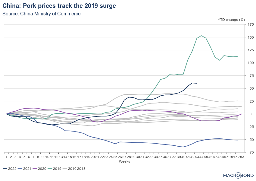
As our chart shows, pork prices have surged more than 50 percent this year, with reports citing the high cost of feed and the impact of reduced breeding stocks a year ago, when prices were falling. Authorities are releasing stocks from the pork reserve to stabilise prices.
In recent years, only 2019 saw a steeper increase. Prices more than doubled that year after an outbreak of African swine fever.
EU carbon trading shows it will get more expensive to pollute
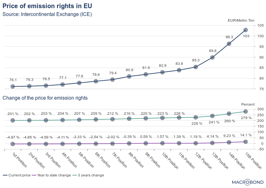
The following chart displays forward prices for the right to emit CO2 in the European Union, with the positions on the X axis reflecting the number of months out from the present moment.
While the curve for the near future is relatively flat, emission prices more than a year from now are approaching EUR 100 per metric ton. The entire pricing curve is three times as expensive as it was three years ago, though it has been mostly stable over the past year.
These rising expenses are bad news for polluters but definitely good news for the climate.
Shipping rates are plunging back to normal
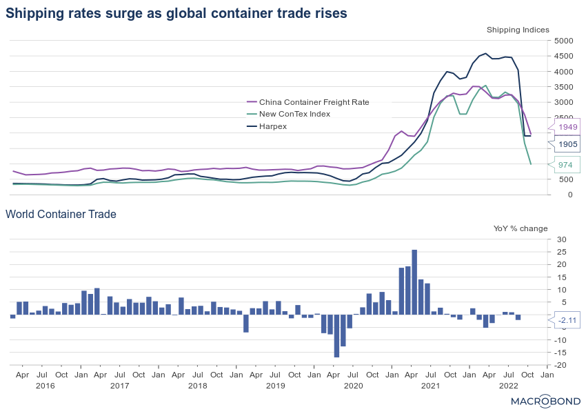
The explosion in shipping costs is over, and the next graph shows just how unusual 2021-22 was.
Due to a combination of strong demand and supply-chain disruptions, shipping rates through much of 2022 were five to eight times higher (and sometimes more) than their pre-pandemic norm. That unprecedented surge was a big contributor to the global spike in inflation.
In recent months, shipping rates have been normalising rapidly as global trade stagnates. As our second chart shows, world container trade is slightly lower than a year ago as the world’s central banks tighten monetary policy.
All written and electronic communication from Macrobond Financial AB is for information or marketing purposes and does not qualify as substantive research.


